Client
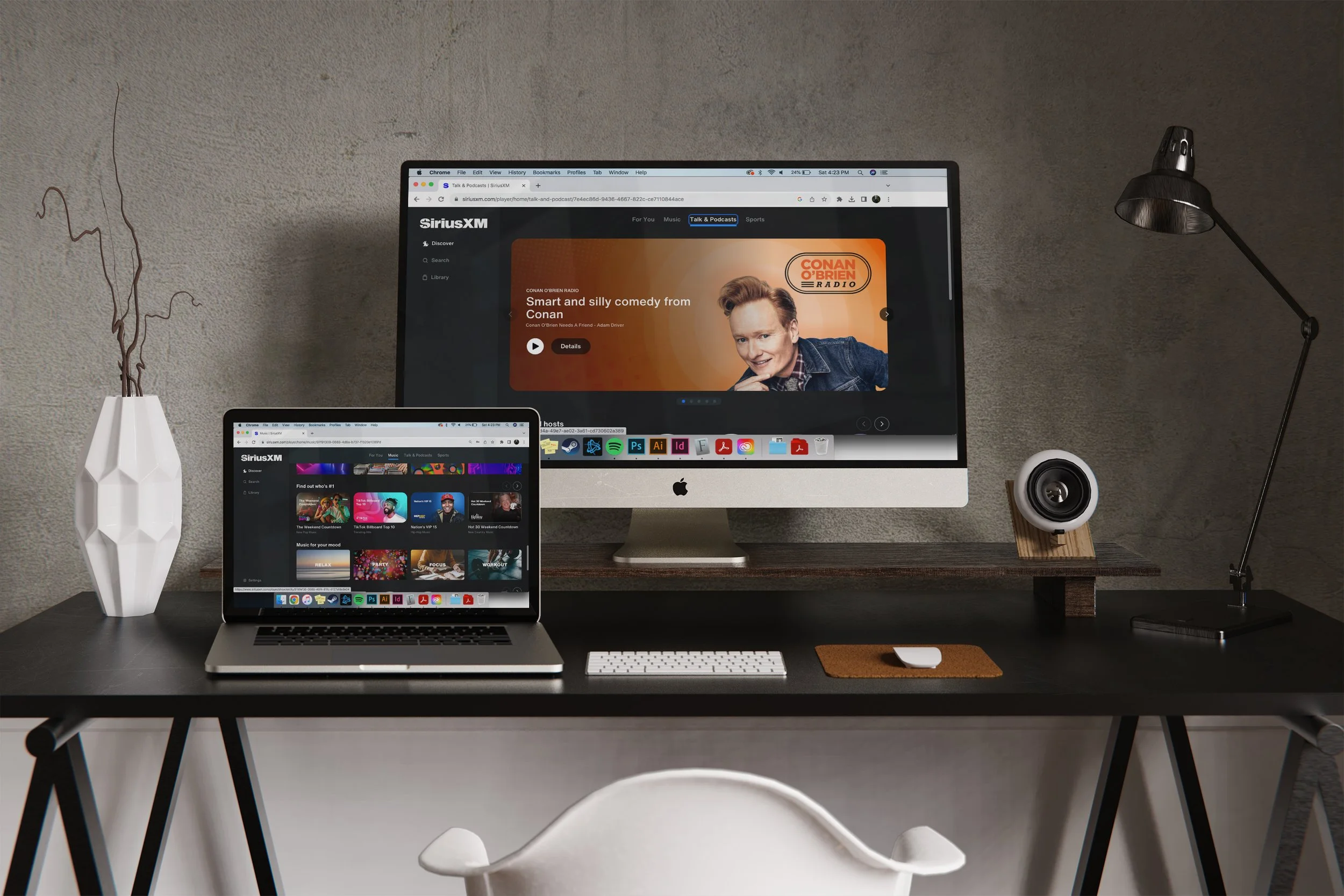
SiriusXM is one of the biggest names in audio entertainment, mostly known for in-car satellite radio. As listening habits evolved, they needed to rethink how they were showing up across digital platforms.
The Ask
They wanted to drive more attention to the web and mobile apps, especially from younger users who were used to streaming. A big part of the challenge was building a design system that could feel custom and flexible for individual shows, channels, and talent, while still staying consistent across thousands of assets.
The Approach
I led design across both web and mobile platforms, working closely with UX, brand, and product teams. The focus was on creating an experience that felt clean, intuitive, and built around discovery. We reworked the navigation, brought in bold type and visuals, and introduced a modular system that could adapt without breaking. The goal was to make each piece feel tailored, without starting from scratch every time.
The Outcome
The redesign gave SiriusXM a stronger presence in the streaming space. It made the digital experience more inviting and helped first-time users explore without friction. Internally, the new system gave teams a flexible toolkit that simplified production and improved consistency. The web app, which had lagged in engagement, finally started gaining traction.
Client
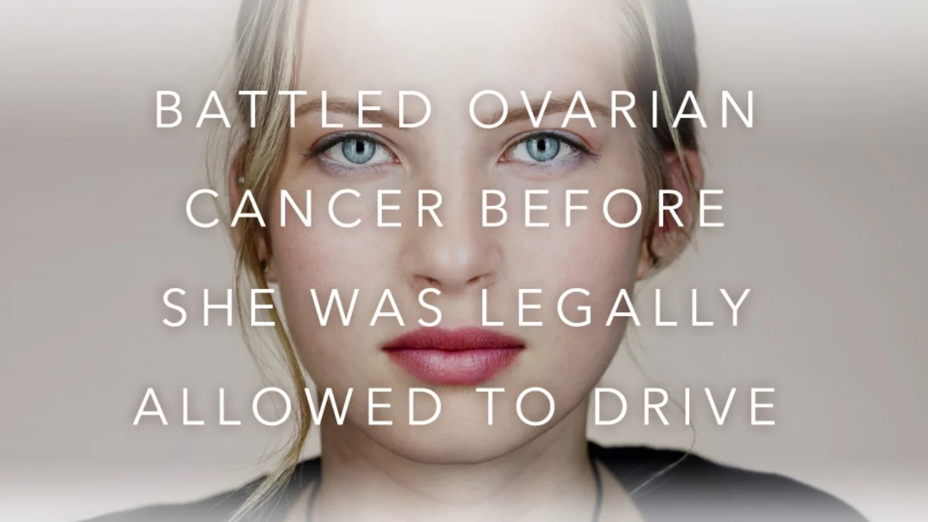
UCHealth is a Colorado-based hospital system focused on innovation, accessibility, and patient-centered care.
The Ask
UCHealth wanted to break away from traditional healthcare marketing and tell real patient stories in a way that felt honest, inspiring, and full of life. The goal wasn’t to spotlight the illness. It was to celebrate what patients had overcome and what they were able to achieve after treatment. The challenge was to bring that optimism forward without losing authenticity.
The Approach
I worked as part of a small creative team to concept and build a multi-channel campaign centered on real patient experiences. We led with documentary-style storytelling and paired it with bold, uplifting visuals that felt unexpected for the category. The focus was always on the positive — showing the strength, resilience, and success of each individual. The campaign lived across TV, print, digital, out-of-home, and social. I helped shape the design direction and extend it across formats, making sure the creative stayed consistent, clear, and emotionally grounded.
The Outcome
The campaign stood out in a space that often feels cold or clinical. It helped UCHealth connect with their community on a deeper level and positioned them as a brand rooted in humanity, innovation, and real impact. The work resonated with both internal stakeholders and the broader audience, and helped set a new tone for future campaigns.
Client
Norton, a cybersecurity brand focused on protecting digital privacy, identity, and data in a connected world.
The Ask
Norton was heading to SXSW with a new documentary to launch, The Most Dangerous Town on the Internet, and a panel to promote. The goal was to generate interest and drive attendance while also helping the brand show up in a fresh, relevant way for a younger, tech-savvy audience. It needed to feel like part of the Austin experience without coming off as a traditional ad campaign.
The Approach
We created a branded shuttle experience that picked up attendees from the airport and took them to their hotels. The buses were fully wrapped in campaign visuals promoting the film and the panel. We also had a street team on the ground helping guide people to transportation, handing out information about the film, and getting the word out across key SXSW locations. The work wasn’t just about awareness — it was about creating a first impression that felt thoughtful, useful, and in tune with the vibe of the festival. I helped lead design on the overall visual system and worked closely with the team to make sure the branding came through clearly across every touchpoint.
The Outcome
The campaign gave Norton a strong presence at SXSW and helped drive real interest in the panel and the premiere. It brought attention to the brand without feeling overly corporate, and it introduced the film in a way that sparked curiosity from the start. The buses became moving billboards, and the activation made sure Norton was part of the conversation all week.
Client
VMware is a global leader in cloud computing and virtualization technology. Their executive leadership team regularly shares high-level strategy and vision across internal events, partner summits, and flagship conferences like VMware Explore.
The Ask
What started as support for executive presentations evolved into a full creative refresh for one of their biggest leadership campaigns. The team needed a cohesive system that worked across keynotes, the website, social media, email, internal comms, and print. The creative had to feel elevated and distinct, but still clearly belong under the larger VMware brand umbrella.
The Approach
I led creative direction across the entire campaign, partnering with executive comms, internal brand teams, and external collaborators. We built a bold, modern visual system that gave the initiative its own identity without breaking from the core brand. For keynotes, I worked closely with each speaker to shape visuals that matched their message and tone. From there, I translated the look and feel into web, social, email, and print pieces, making sure everything felt consistent but purpose-built for its channel.
The Outcome
The campaign gave VMware leadership a strong, cohesive presence across every touchpoint. It struck the right balance between brand alignment and fresh creative energy. The work was well received by both internal and external audiences and became a go-to reference for future executive campaigns. I continued to support the team on high-priority creative as new needs came up.
Client
Pandora, the streaming music platform known for personalized listening and a long-standing role in music discovery.
The Ask
I worked with Pandora on a couple of distinct creative projects aimed at elevating how the brand showed up visually, both in-app and in the real world.
The first project was a series of custom illustrations for artists featured on the platform. These were used across digital channels to promote new releases, exclusive content, and curated playlists. Each illustration was tailored to reflect the artist’s personality and musical style while still feeling connected to Pandora’s visual language. The work appeared in the web app, on mobile, and in social content.
The second project was designing custom poly bags for branded merchandise. These were used for shipping gear and swag to artists, influencers, and partners. The goal was to make the unboxing feel intentional and on-brand, while standing out from typical ecommerce packaging. I developed a few design directions and worked with the team to finalize a look that was bold, clean, and unmistakably Pandora.
The Outcome
Both projects helped bring more personality and polish to how Pandora connects with its audience — online and offline. The artist illustrations gave listeners a more personal way to engage with featured content, and the branded packaging created a more premium and cohesive experience for merch and promo drops.
Client
Walmart.com, the digital retail arm of one of the world’s largest companies.
The Ask
This was a full redesign of the Walmart.com site and its email communications. The goal was to reposition Walmart as more than just a destination for low prices — we wanted to introduce a more aspirational, lifestyle-driven feel that could sit comfortably alongside premium brands.
The Approach
I was the lead designer focused on the electronics department, which included flagship brands like Apple, Samsung, Google, Sony, and Microsoft. The work had to elevate Walmart’s digital presence without losing its core value-driven identity. We built a cleaner, more modern visual language that could work across the site, promotional banners, and all outbound communications.
This wasn’t just a visual facelift. We looked at the entire customer experience — how products were browsed, how messaging guided the user, and how the brand could show up in a way that felt more curated and premium, especially within high-tech categories.
The Outcome
The redesign helped shift perception of Walmart.com, especially in the electronics space. It gave the brand a more modern, credible voice in a highly competitive category, and opened the door for deeper engagement with audiences looking for both value and quality. The updated system also set a stronger foundation for future seasonal and brand campaigns across digital channels.
The Ask
This was the launch campaign for Norton Core, their first-ever secure Wi-Fi router. The product combined high-end design with strong built-in security. The goal was to make a bold entrance into the consumer hardware space and get people to think differently about cybersecurity.
The Approach
The creative had to do a few things. It needed to introduce the product, highlight the security features in a way that was easy to understand, and position the device as something that belonged on your shelf, not hidden behind it.
I worked on a range of materials including video, social, landing pages, and overall campaign direction. Visually, we leaned into the faceted, geometric design of the router and treated it like a piece of modern home decor. The messaging stayed simple and focused on benefits, not just specs.
The Outcome
The launch set Norton up as a serious player in connected home security. It shifted the conversation from cybersecurity as software to cybersecurity as part of your lifestyle. The work made an impact visually and strategically, giving the product the attention it needed at launch.
Client
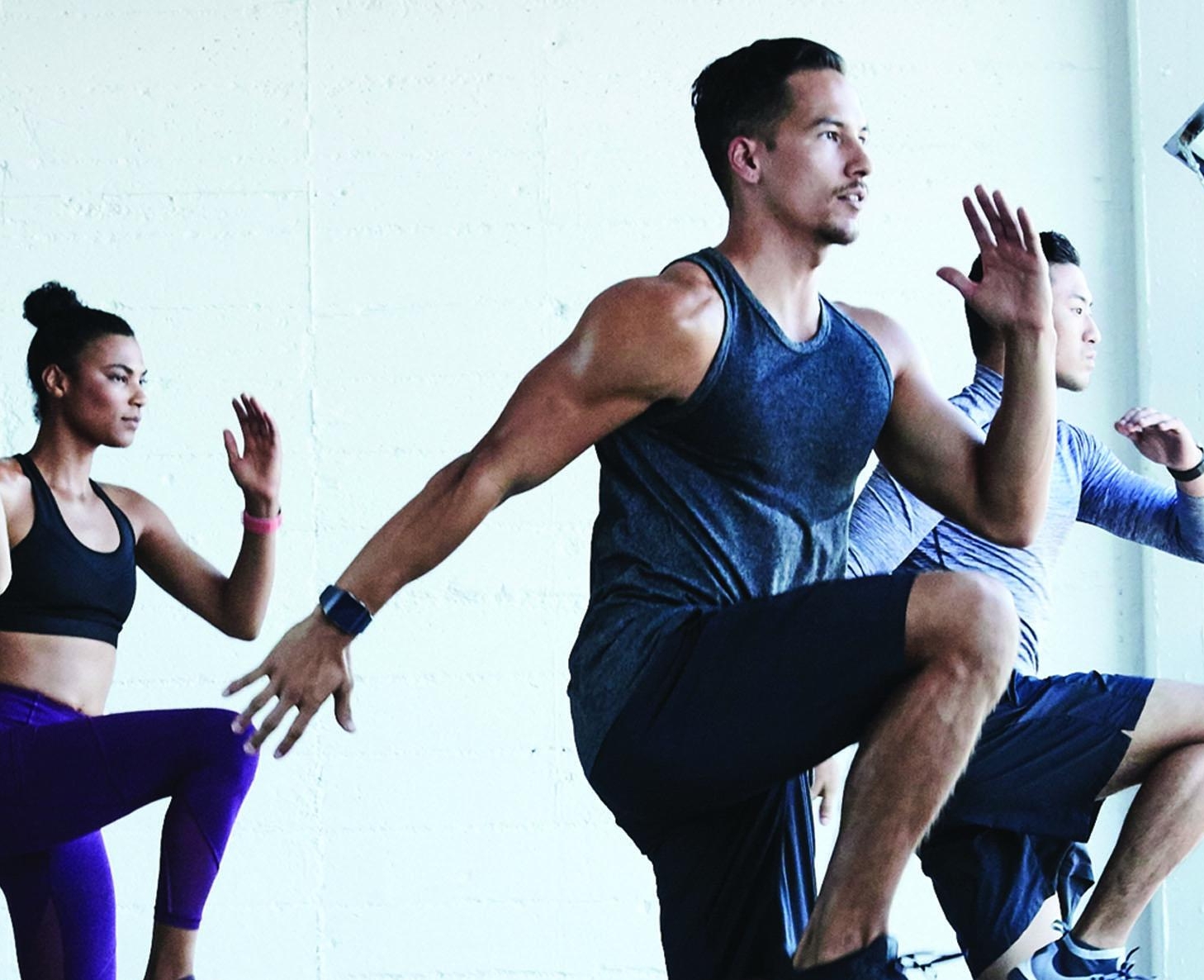
Fitbit, a leader in health and fitness wearables.
The Ask
This was for the launch of Fitbit’s first smartwatch. The goal was to introduce the product as more than just a fitness tracker — this was a full-featured smartwatch that could compete with the big players in the space. The creative had to build excitement, explain the features, and position Fitbit as a serious contender in the wearable tech market.
The Approach
I worked on digital assets that supported both the product launch and ongoing marketing — everything from landing pages to email to app content. The design had to feel elevated but still true to Fitbit’s friendly, health-focused personality.
We leaned into clean visuals, bold typography, and lifestyle imagery that showed the watch in real-world use. The messaging focused on what made the watch unique, highlighting health insights, ease of use, and seamless integration with users’ routines.
The Outcome
The campaign helped Fitbit make a strong debut in the smartwatch category. It introduced the product in a way that felt fresh and competitive, while still keeping the brand approachable and focused on everyday wellness.
Client
VMware, a global leader in cloud computing and enterprise technology.
The Ask
This was a full brand refresh designed to shift the perception of VMware. The tech space is often dark, dense, and overly technical. The goal here was to bring some lightness and positivity to the brand — to make it feel more human, more accessible, and more optimistic without losing the trust and credibility that comes with being an enterprise leader.
The Approach
We built a visual and messaging system that leaned into clarity, warmth, and simplicity. The refresh touched everything from digital ads to internal decks to large-scale campaigns. I led creative direction and worked across teams to make sure the system worked at every level — from global campaigns to quick-turn regional requests.
Design-wise, we introduced lighter colors, more breathing room, and a more editorial approach to layout and typography. The tone shifted to something more encouraging and solution-focused. Everything was built to scale, but still gave individual teams enough room to tailor the work to their specific needs.
The Outcome
The brand became more approachable without losing authority. It helped VMware stand out in a sea of overly complex tech messaging and gave internal teams a stronger, more consistent foundation to build from. The refresh also made it easier to tell customer stories, highlight real-world impact, and connect with audiences in a way that felt fresh and honest.
The Ask
The goal was to introduce the brand to a younger U.S. audience through a campaign that felt bold, confident, and a little unexpected. We needed to find a way to cut through the noise of the wine aisle while staying true to Graffigna’s heritage and story.
The Approach
We leaned into the brand’s Argentine roots and brought a modern twist to the traditional wine category. The concept was built around the idea of boldness bold wine, bold moves, bold design. I helped craft campaign visuals and packaging that felt fresh and eye-catching, with a strong graphic system and a clear point of view.
The design work pulled from fashion and lifestyle cues rather than typical wine tropes. We focused on standing out on the shelf and resonating with a new generation of wine drinkers who care as much about aesthetics as they do about taste.
The Outcome
The creative gave Graffigna a clear, memorable identity for the U.S. launch. It helped position the wine as stylish and approachable, not stuffy or traditional. The work supported retail presence and marketing efforts, and gave the brand a stronger foundation to grow in a new market.
Print and Out of Home campaign for UCHealth
Print, digital, and out of home ads for technology company VMware and their “everyware" campaign.
Digital & print marketing for Norton by Symantecs new film "The Most Dangerous Town on The Internet"
Client
Walmart.com, the ecommerce arm of one of the largest retailers in the world.
The Ask
Walmart needed high-performing email campaigns that promoted everything from seasonal events to daily deals, while keeping the focus on value and trust. I led design for the entertainment and electronics categories, which were two of the top-performing departments in terms of revenue and traffic.
The Approach
As lead designer, I worked closely with the marketing team to concept, design, and refine email campaigns that featured major brands like Apple, Samsung, Google, and Bose. Every email needed to balance brand storytelling, urgency, and clear calls to action. I also reviewed performance data with the marketing team, looking at metrics like open rates and click-through rates to guide design decisions for future sends. The goal was always to create emails that were clean, shoppable, and optimized for results.
The Outcome
The campaigns helped drive major profit and sales, especially during key retail windows. The emails performed well across both desktop and mobile, and the collaboration with marketing led to consistent gains in engagement. The work became a reliable part of Walmart.com’s performance strategy in high-traffic categories.
Rebranding of print and web/mobile Collateral for client Shire and the drug Vyvanse
The Ask
Pro Squared was growing fast and needed a brand identity that reflected the level of professionalism and detail they bring to their work. Their original look felt generic and didn’t match the quality of service they were delivering. The goal was to create a brand that felt sharp, reliable, and built for scale.
The Approach
I led the design of a new visual identity for the company, starting with an updated logo, color palette, and type system. The focus was on simplicity and precision. Something that communicated cleanliness and professionalism without feeling cold or corporate.
We also created supporting materials, including social media and branded collateral, to help bring the new identity into the real world. Everything was built with longevity and clarity in mind, so the brand could grow along with the business.
The Outcome
The new identity gave Pro Squared a more polished and confident presence. It helped establish trust with clients and made the brand feel like a serious contender in the commercial cleaning space. The work set them up with a foundation they could build on as they continue to expand.
pages and projects where I have contributed to the UX/UI design from Walmart.com, VMware, and SiriusXM